The ProjectThe "We Are Data" exhibit opened in Dec 2019. It was one of the first projects working with local third-party developer Schema to create an experience that let guests experience data collection firsthand.
I worked closely with the Exhibit Graphic Designer Beth Gibson to design our in-house builds based on the aesthetics and vision for the exhibit. |
Build Requirements
|
Our Solutions
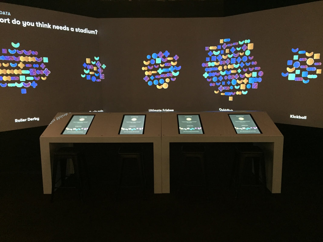
The highlight of this exhibit is the projected data collection experience. Beth and I brainstormed an aesthetic vision that combined futuristic design elements while remaining playful, taking inspiration from Schema's data "icon" designs. Because we wanted the projected experience to be an eye-catching draw from across the floor of the Pacific Science Center, we needed to create a striking mood contrast to define the space.
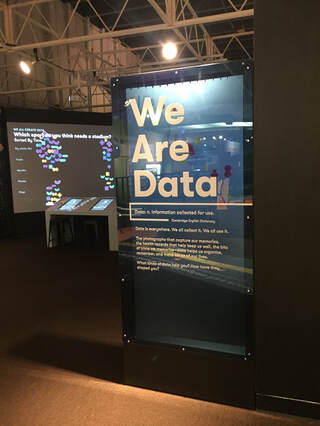
Using lighting and building false walls, we nooked the area off, for both practical purposes (to keep the projected area dark) and to create the feeling of entering a new world. We spent months designing the kiosk element, the crux of the exhibit. We wanted it to feel like you were at the command of a giant intergalactic spaceship, with the power of data at your fingertips!
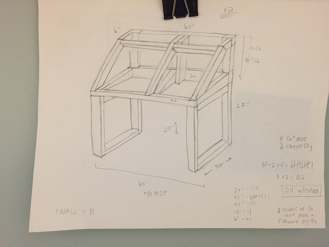
After a few rounds of back-and-forth with the development team, I designed a kiosk that would fit the design requirements from all of the various stakeholders in the process. I connected with Schema and our in-house IT department to confirm spacial requirements for the intensive tech component of the kiosk. I worked with Beth to keep our aesthetic vision connected. I specified ADA requirements for tables and interactive exhibits, and used my own experience with the back-end of maintaining exhibits to choose durable materials that would actually make it easy to work on the exhibit as needed.
After a few rounds of back-and-forth with the development team, I designed a kiosk that would fit the design requirements from all of the various stakeholders in the process. I connected with Schema and our in-house IT department to confirm spacial requirements for the intensive tech component of the kiosk. I worked with Beth to keep our aesthetic vision connected. I specified ADA requirements for tables and interactive exhibits, and used my own experience with the back-end of maintaining exhibits to choose durable materials that would actually make it easy to work on the exhibit as needed.
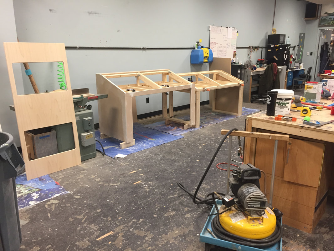
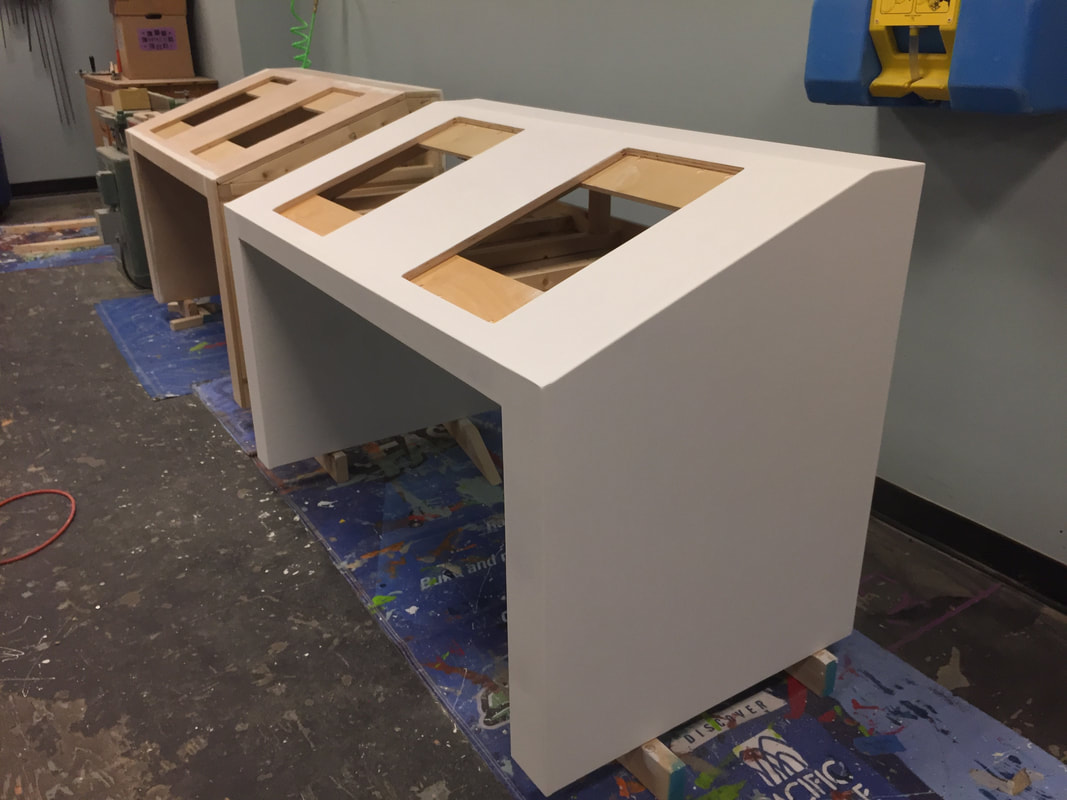
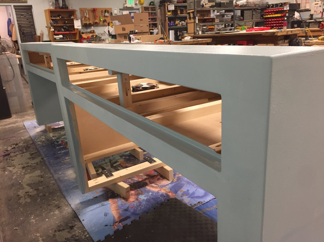
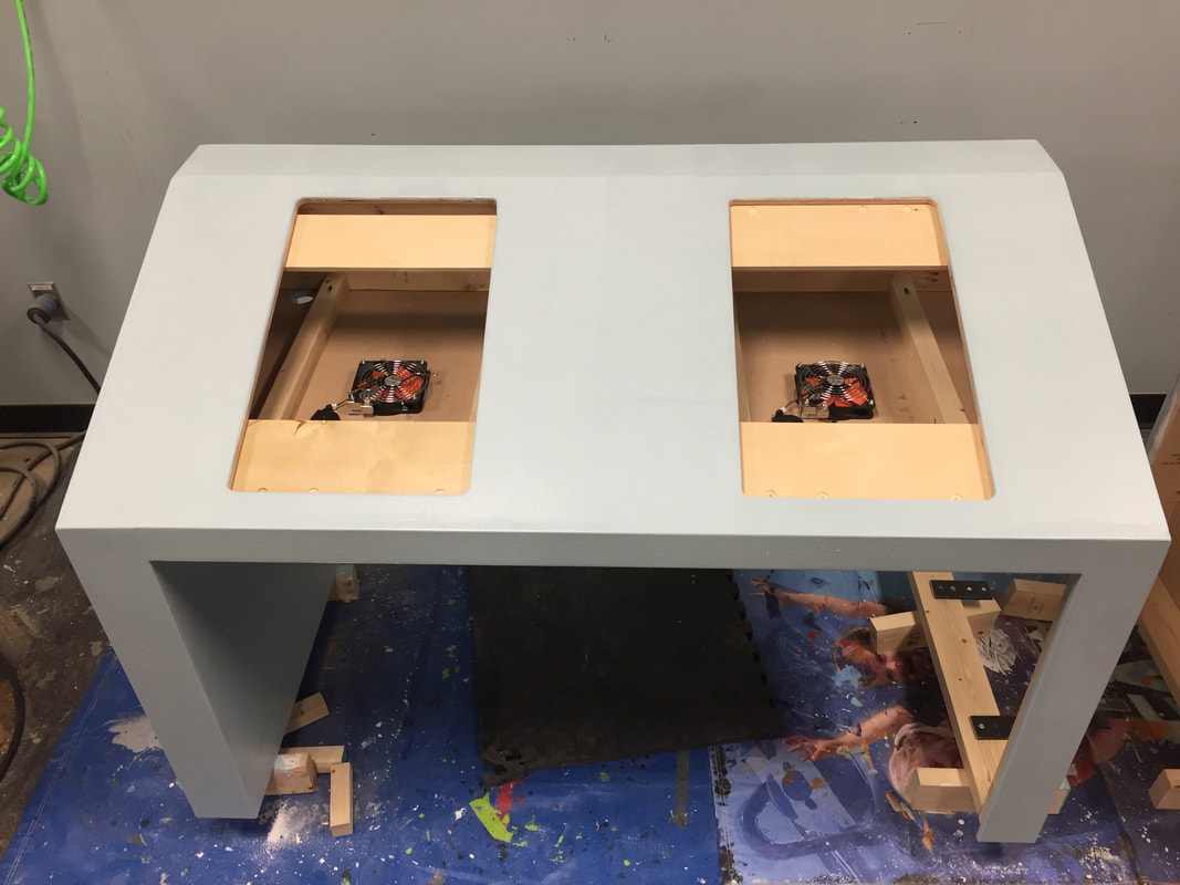
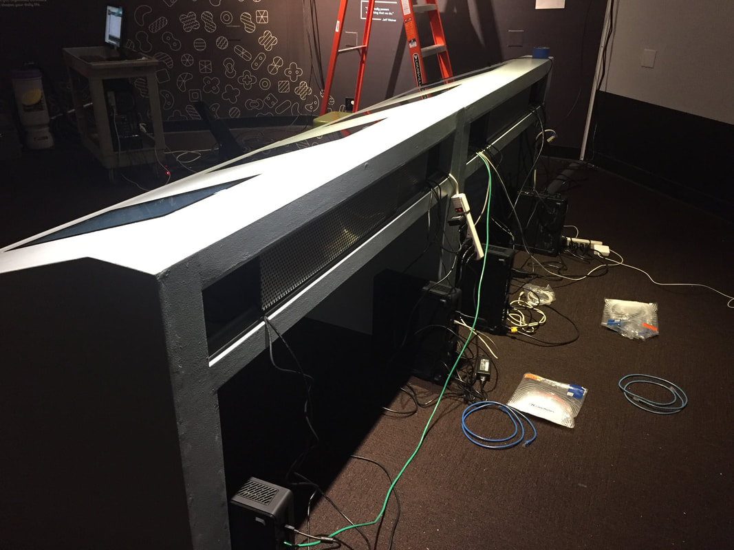
Once all stakeholders were satisfied, I finalized a two-part table design that was accessible for ADA requirements as well as being a median height for people of all ages. Maintenance accessibility and air flow are key in tech-heavy exhibits, so I designed an easily accessed sliding aluminum hatch for the back panel that also allows for next-level cable management. The screens are dropped into the inside 2x4 framing and are topped with a custom routed acrylic sheet that holds it in place; that allows the technicians to easily clean the surface while also adding ambient environmental pizazz as the surface catches and reflects the projected experience.
Oh, and that table being at an angle? Sure, it catches your eye and makes it easier for littler guests to see and access the screen, and is a more ergonomic and sophisticated physical experience. But it also prevents guests from resting damaging drinks, scratching purses, and literal children on the face of the expensive touch-screen tech! Shhh....that one was my own little form + function design secret!
